 RmlUi Documentation
Progress
The <progress> element can display progress bars and gauges. The bar or gauge will be filled according to the provided value.
You can find the RML documentation for the progress element here.
Interface
The Rml::ElementProgress class (found in <RmlUi/Core/Elements/ElementProgress.h>) defines the interface to the progress element.
The progress value and maximum value can be set through the C++ interface.
/// Returns the value of the progress bar.
float GetValue() const;
/// Sets the value of the progress bar.
void SetValue(float value);

/// Returns the maximum value of the progress bar.
float GetMax() const;
/// Sets the maximum value of the progress bar.
void SetMax(float max_value);
Otherwise, the value and the other attributes can be set using the Element::SetAttribute function.
Styling
The progress element generates a non-dom fill child element which can be used to style the filled part of the bar. The fill element can use normal properties such as background-color, border, and decorator to style it. The fill element will automatically be positioned and sized to cover the content region of the parent progress element, then scaled down according to its value and direction attributes.
Alternatively, use the fill-image property to style the filled part of the progress bar. This property enables one to set an image which will be clipped according to the progress value. The fill-image property is the only way to style circular progress bars (clockwise and counter-clockwise directions). The fill element is still available but it will always be fixed in size independent of the value attribute.
RCSS property
fill-image
| Value: | <string> |
| Initial: | empty |
| Applies to: | progress element |
| Inherited: | no |
| Percentages: | N/A |
The fill-image property sets an image to represent the filled part of the progress element. It will be sized according to the progress bar’s value. This property is the only way to style circular progress bars (clockwise and counter-clockwise directions).
The value <string> refers to a sprite name or an image url.
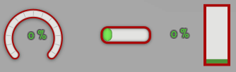
Examples
The following RCSS styles three different progress bars.
@spritesheet progress_bars
{
	src: my_progress_bars.tga;
	gauge:             0px 271px 100px 86px;
	gauge-fill:        0px 356px 100px 86px;
	progress:        103px 267px  80px 34px;
	progress-fill-l: 110px 302px   6px 34px;
	progress-fill-c: 140px 302px   6px 34px;
	progress-fill-r: 170px 302px   6px 34px;
}
.gauge {
	decorator: image( gauge );
	width: 100px;
	height: 86px;
	fill-image: gauge-fill;
}
.horizontal {
	decorator: image( progress );
	width: 80px;
	height: 34px;
}
.horizontal fill {
	decorator: tiled-horizontal( progress-fill-l, progress-fill-c, progress-fill-r );
	margin: 0 7px;
	/* padding ensures that the decorator has a minimum width when the value is zero */
	padding-left: 14px;
}
.vertical {
	width: 30px;
	height: 80px;
	background-color: #E3E4E1;
	border: 4px #A90909;
}
.vertical fill {
	border: 3px #4D9137;
	background-color: #7AE857;
}
Now they can be used in RML as follows.
<progress class="gauge" direction="clockwise" start-edge="bottom" value="0.3"/>
<progress class="horizontal" value="75" max="100"/>
<progress class="vertical" direction="top" value="0.6"/>
The result can be seen in the following animation where text labels have been added as well.