 RmlUi Documentation
Glow font effect
The glow font effect renders a blurred outline around the text.
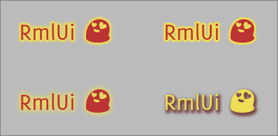
Both the outline pass and the subsequent blur pass can be controlled independently. Additionally, an offset can be applied which makes the effect suitable for generating drop shadows as well.
The effect is declared as:
font-effect: glow( <width-outline> <width-blur> <offset-x> <offset-y> <color> );
Its properties are specified by the following.
width-outline
| Value: | <length> |
| Initial: | 1px |
| Percentages: | N/A |
Determines the outline width of the effect.
width-blur
| Value: | <length> |
| Initial: | -1px |
| Percentages: | N/A |
Determines the blur width of the effect. For negative specified values, the used value will be copied from width-outline.
offset-x
| Value: | <length> |
| Initial: | 0px |
| Percentages: | N/A |
offset-y
| Value: | <length> |
| Initial: | 0px |
| Percentages: | N/A |
These properties define the offset, in pixels, between the source text and the glow.
color
| Value: | <color> |
| Initial: | white |
| Percentages: | N/A |
The color is applied multiplicatively over the entire effect.
/* Declares a glow font effect. */
h1
{
	font-effect: glow( 3px #ee9 );
}
/* The glow effect can also create nice looking shadows. */
p.glow_shadow
{
	color: #ed5;
	font-effect: glow(2px 4px 2px 3px #644);
}