 RmlUi Documentation
Flexible boxes
Flexible box (flexbox) layout is made for placing items along a single direction. It allows flexible sizing of items, both shrinking to avoid overflow and growing to fill the container. Both horizontal and vertical alignment can be controlled. Together, these properties make this layout scheme powerful for many types of user interfaces.
RmlUi generally follows the CSS Flexible Box specification, although there are some smaller differences. There are many resources on how to write flexbox layout in CSS on the web, see e.g. a flexbox introduction at MDN and an illustrated overview of the flexbox properties at CSS-Tricks.
Flexbox layout is initialized by setting an element’s display property to display: flex or display: inline-flex. This generates a flex container for the element, and all its children are formatted as flex items within this container. In RCSS, inline-flex boxes are required to have their widths set to a definite (non-auto) value.
Basic example
.flex {
	display: flex;
	background: #66806a;
	padding: 3px;
}
.flex > div {
	background-color: #fff1af;
	padding: 10px;
	margin: 3px;
	flex: 1;
}
.flex > .double-width {
	flex: 2;
}
h2 {
	text-align: center;
	font-size: 1.3em;
	color: #243434;
	border-bottom: 1px #666;
}
<div class="flex">
	<div>
		<h2>First column</h2>
		<p>Etiam libero lorem.</p>
	</div>
	<div>
		<h2>Second column</h2>
		<p>Ut volutpat, odio et facilisis molestie, lacus elit euismod enim.</p>
	</div>
	<div class="double-width">
		<h2>Third column</h2>
		<p>Lorem ipsum dolor sit amet.</p>
	</div>
</div>
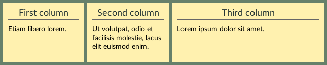
Output
The rendered output is shown below. Notice that all columns are the same height. This is easy to accomplish in flexible layout, but difficult in any other layout mode when the height depends on the content. Furthermore, the width of the last column will always be exactly twice the width of each of the first two columns.
Differences from CSS
Behavior
- Anonymous flex items will not be constructed from non-wrapped text.
- Automatic minimum size of flex items is only applied when they have no definite size, and only in column mode.
- Baseline alignment is only approximate.
- Stretched items are not reformatted.
Properties and values
- Property
orderis not supported. - Property value
flex-basis: contentis not supported. - Property value
visibility: collapseis not supported.
Performance
To achieve the best performance, avoid content based sizing to prevent formatting the same flex items multiple times:
- Use the
flex: <number ≥ 1>shorthand. - Set a definite height (length or percentage) on the flex items – or width in column layout.
This is increasingly important to consider when the flex items are complicated to format, and essential when using flexbox for larger layout structures. The above rules can also be used only on the most demanding flex items in a given flex container, while using content-based sizing for any other items as suitable.
Orientation
flex-direction
| Value: | row | row-reverse | column | column-reverse |
| Initial: | row |
| Applies to: | flex containers |
| Inherited: | no |
| Percentages: | N/A |
Determines the direction the flex items are laid out in – the main axis. Using row or row-reverse, the main axis is horizontal, while for column or column-reverse the main axis is vertical. The -reverse suffixes makes items be arranged in reverse order along the main axis.
flex-wrap
| Value: | nowrap | wrap | wrap-reverse |
| Initial: | nowrap |
| Applies to: | flex containers |
| Inherited: | no |
| Percentages: | N/A |
When there is no more space to place items along the main axis, the wrap and wrap-reverse values makes it so the items are wrapped to a new flex line along the cross axis. The cross axis is defined as perpendicular to the main axis. The wrap-reverse value makes lines be arranged in reverse order.
flex-flow
A shorthand for setting the flex-direction and flex-wrap properties in that order.
Flexibility
The ‘flex’ shorthand
flex
| Value: | auto | none | <flex-grow> <flex-shrink>? <flex-basis>? | <flex-basis> |
| Initial: | 0 1 auto |
| Applies to: | flex items |
| Inherited: | no |
| Percentages: | N/A |
A shorthand property for setting the flexible sizing behavior of flex items. Generally, the following short forms should cover most use cases:
flex: *default*- Equivalent to
flex: 0 1 auto. Items will be sized according to their content size, but allow shrinking proportionally if the container is too small in order to avoid overflow. flex: auto- Equivalent to
flex: 1 1 auto. Items will initially be sized according to their content size and then proportionally shrink or grow to fill the container. flex: none- Equivalent to
flex: 0 0 auto. Items will be sized according to their content size, and neither shrink nor grow. flex: <number ≥ 1>- Equivalent to
flex: <number> 1 0. Items will be sized proportionally to their given<number>and fill the container. This enables the best performance.
When omitted from the flex shorthand, flex-grow and flex-shrink default to 1, while flex-basis defaults to 0. Note that this is different from their initial values.
The flexbox sizing algorithm will also respect min- and max-sizing constraints given on the items.
Individual flexible properties
The flexible size properties can also be controlled individually.
flex-grow
| Value: | <number> |
| Initial: | 0 |
| Applies to: | flex items |
| Inherited: | no |
| Percentages: | N/A |
Sets the grow factor, allowing items to be grown from their initial size to match the container size, thereby filling the container. The flex items will grow proportionally to their given factor.
flex-shrink
| Value: | <number> |
| Initial: | 1 |
| Applies to: | flex items |
| Inherited: | no |
| Percentages: | N/A |
Sets the shrink factor, allowing items to shrink from their initial size to match the container size, thereby avoiding overflow. The flex items will shrink proportionally to their given factor.
flex-basis
| Value: | <length> | <percentage> | auto |
| Initial: | auto |
| Applies to: | flex items |
| Inherited: | no |
| Percentages: | relative to the flex container’s inner main size |
Sets the flex item’s basis size. That is, this gives the initial size before the item is grown or shrunk using the above factors. When specified as auto, the item’s shrink-to-fit width will be used – or automatic block height in column layout. Otherwise, units are resolved the same way as for the width property. Note that shrink-to-fit width is not implemented for tables, so they will be treated as a zero-width box when flex-basis is auto, instead, set a definite (non-auto) width or flex basis to ensure proper sizing.
Alignment
Alignment occurs after sizing all the flex items, and determines how any available space is distributed between items, within flex lines, and between flex lines.
Margin ‘auto’ alignment
In cases where free space is available along either the main- or cross axis, flex items can be aligned by filling this space using margin: auto along the desired direction(s). When there are multiple auto-margins along a single axis they will each be given an equal proportion of the available space.
Note that any free space filled by auto-margins will thereby leave no more space for alignment with justify-content or align-self along that axis.
Main-axis alignment
justify-content
| Value: | flex-start | flex-end | center | space-between | space-around | space-evenly |
| Initial: | flex-start |
| Applies to: | flex containers |
| Inherited: | no |
| Percentages: | N/A |
Determines the alignment of items along the main axis, that is, horizontal alignment in row layout.
Cross-axis alignment
align-items
| Value: | flex-start | flex-end | center | baseline | space-around | stretch |
| Initial: | stretch |
| Applies to: | flex containers |
| Inherited: | no |
| Percentages: | N/A |
Determines the alignment of items along the cross axis, that is, vertical alignment in row layout.
align-self
| Value: | auto | flex-start | flex-end | center | baseline | space-around | stretch |
| Initial: | auto |
| Applies to: | flex items |
| Inherited: | no |
| Percentages: | N/A |
Override the cross-axis alignment specified on the parent container for this item only.
Packing flex lines
align-content
| Value: | flex-start | flex-end | center | space-between | space-around | space-evenly | stretch |
| Initial: | stretch |
| Applies to: | multi-line flex containers |
| Inherited: | no |
| Percentages: | N/A |
Determines how any available space in the flex container is distributed between multiple flex lines.
Gaps between flex items
row-gap, column-gap
| Value: | <length> | <percentage> |
| Initial: | 0px |
| Applies to: | flex containers and table elements |
| Inherited: | no |
| Percentages: | relative to the height and width, respectively, of the initial flex container or table block size |
Specifies the gap between flex items, as if adding a fixed-size margin between adjacent flex items. In RCSS, these properties can also be used on tables.
gap
A shorthand property for setting both row-gap and column-gap properties, in that order. If only a single value is specified, it sets both gap properties to the given value.