 RmlUi Documentation
Filters
Filters allow for various visual effects to be applied to elements, such as color adjustments, blurring, and shadows. Filters can be declared and configured in a style sheet. This way, a filter can be applied to an entire element, or to the backdrop of an element. In addition, filters are used internally to apply certain effects, like the blur effect used on box shadows. RmlUi supports all filters specified in CSS.
To use filters, the backend renderer must support advanced rendering features, see the render interface feature table for details. See also the related C++ documentation for how to define custom filters.
RmlUi filters
RmlUi comes with several built-in filter functions for applying visual effects to elements and other inputs.
| Filter function | Description |
|---|---|
| blur | Applies a Gaussian blur effect to the input. |
| brightness | Adjusts the brightness of the input. |
| contrast | Adjusts the contrast of the input. |
| drop-shadow | Applies a drop shadow effect to the input. |
| grayscale | Converts the input colors to grayscale. |
| hue-rotate | Rotates the hue of the input. |
| invert | Inverts the colors of the input. |
| opacity | Adjusts the opacity of the input. |
| saturate | Adjusts the color saturation of the input. |
| sepia | Applies a sepia tone to the input. |
Graphic filters: The ‘filter’ property
The filter property is specified as follows.
filter
| Value: | none | [ <filter-function>( <properties> ) ]+ |
| Initial: | none |
| Inherited: | no |
| Percentages: | N/A |
- <filter-function>
- One of the supported filter functions
- <properties>
- Determines the properties specific to the filter function.
For illustration, a single filter can be used as follows.
filter: sepia(1.5);
Multiple filters can be specified using a space-separated list. Filters are applied in the order they are specified.
filter: brightness(1.2) contrast(150%) hue-rotate(90deg);
Backdrop filters: The ‘backdrop-filter’ property
Backdrop filters apply filter effects to the area behind an element. This allows you to apply filters to the backdrop without affecting the content of the element itself. The backdrop is the area behind the background of the element, this means that any background-color may obscure the backdrop.
backdrop-filter
| Value: | none | [ <filter-function>( <properties> ) ]+ |
| Initial: | none |
| Inherited: | no |
| Percentages: | N/A |
The backdrop-filter property uses the same filter functions as the filter property. Multiple backdrop filters can be specified using a space-separated list.
Examples
The following demonstrates how to declare a variety of filters.
/* Apply a grayscale filter */
filter: grayscale(0.5);

/* Apply transparency to the entire element, including its children */
filter: opacity(0.5);

/* Add a red drop shadow with a blur effect */
filter: drop-shadow(#f33f 30px 20px 5px);

/* Apply multiple filters */
filter: blur(20px) hue-rotate(45deg) brightness(130%);
The next example creates a frosted glass effect by applying a blur and slight darkening to the area behind the element.
.frosted-glass {
    background-color: #fffa;
    backdrop-filter: blur(10px) brightness(90%);
}
The following shows a round orb, blurring the background and itself, with a yellow tint rendered around its edges.
.blur_orb {
    width: 350px;
    height: 350px;
    border-radius: 200px;
    background: #fff0;
    filter: drop-shadow(#ff7 0 0 30px) blur(40px);
    backdrop-filter: blur(50px);
    border: 2px black;
}
Filters can also be animated, as shown in the following.
@keyframes animate-filter {
    from { filter: drop-shadow(#f00) opacity(1.0) sepia(1.0); }
    to   { filter: drop-shadow(#000 30px 20px 5px) opacity(0.2) sepia(0.2); }
}
.animate {
    animation: animate-filter 1.5s cubic-in-out infinite alternate;
}
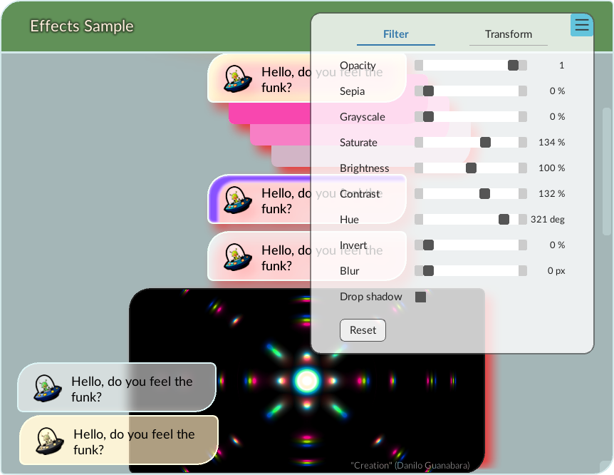
Sample
Make sure to check out the effects sample in RmlUi, which showcases all the built-in filters.
Filter functions
blur
Applies a Gaussian blur to the input.
filter: blur( <sigma> );
<sigma>
| Value: | <length> |
| Initial: | 0px |
Specifies the standard deviation of the blur effect. A value of zero means no blur.
Note: The box-shadow property uses the blur radius rather than the standard deviation to specify the amount of blur to apply. The blur radius is equivalent to 2 * sigma. This difference originates in the CSS specification.
brightness
Adjusts the brightness of the input.
filter: brightness( <amount> );
<amount>
| Value: | <number> | <percentage> |
| Initial: | 1 |
Specifies the brightness level. A value of 0% will create a completely black element, while values higher than 100% will provide brighter results.
contrast
Adjusts the contrast of the input.
filter: contrast( <amount> );
<amount>
| Value: | <number> | <percentage> |
| Initial: | 1 |
Specifies the contrast level. A value of 0% will create a completely gray element, while values higher than 100% will provide more contrast.
drop-shadow
Applies a drop shadow effect to the input.
filter: drop-shadow( <color>? <offset-x> <offset-y> <sigma>? );
Values are interpreted like for the box-shadow property, except that the third length argument specifies the standard deviation (sigma) instead of the blur radius.
<color>
| Value: | <color> |
| Initial: | black |
Specifies the color of the shadow.
<offset-x>
| Value: | <length> |
| Initial: | 0px |
Specifies the horizontal offset of the shadow.
<offset-y>
| Value: | <length> |
| Initial: | 0px |
Specifies the vertical offset of the shadow.
<sigma>
| Value: | <length> |
| Initial: | 0px |
Specifies the standard deviation of the blur effect to apply to the shadow. A value of zero means no blur.
Note: The box-shadow property uses the blur radius rather than the standard deviation to specify the amount of blur to apply. The blur radius is equivalent to 2 * sigma. This difference originates in the CSS specification.
grayscale
Converts the colors to grayscale.
filter: grayscale( <amount> );
<amount>
| Value: | <number> | <percentage> |
| Initial: | 0 |
Specifies the amount of the effect. A value of 100% is completely gray.
hue-rotate
Rotates the hue of the input colors.
filter: hue-rotate( <angle> );
<angle>
| Value: | <angle> |
| Initial: | 0deg |
Specifies the hue rotation to apply. A value of 0deg leaves the hue unchanged.
invert
Inverts the colors of the input.
filter: invert( <amount> );
<amount>
| Value: | <number> | <percentage> |
| Initial: | 0 |
Specifies the amount of the inversion. A value of 100% will completely invert the input colors.
opacity
Adjusts the opacity of the input.
filter: opacity( <amount> );
<amount>
| Value: | <number> | <percentage> |
| Initial: | 1 |
Specifies the opacity level. A value of 0% makes the element completely transparent, while 100% leaves it unchanged.
saturate
Adjusts the color saturation of the input.
filter: saturate( <amount> );
<amount>
| Value: | <number> | <percentage> |
| Initial: | 100% |
Specifies the saturation amount. A value of 0% is completely unsaturated (gray), while values higher than 100% provide over-saturated results.
sepia
Applies a sepia tone to the input.
filter: sepia( <amount> );
<amount>
| Value: | <number> | <percentage> |
| Initial: | 0% |
Specifies the amount of the effect. A value of 100% is completely sepia toned.